New MasterPages
With a new SharePoint version, come also new MasterPages, with differences in both technology and design considerations (HTML5, CSS classes...). So, to get started with creating your 2013 targeted branding solution, you can either copy Oslo or Seattle and start with those, or do the (in my opinion) slightly easier approach and download the 2013 Starter Masters by Randy Drisgill and use those (read the instruction on the page before using).
One cool thing about the 2013 MasterPages is that the same MasterPage applies to search sites too so you don't need to be creating a separate one for that anymore.
Location of design files
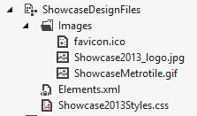
In SharePoint 2010 the common way was to delpoy design files, such as images and the CSS and JavaScript files in either the Layouts folder (mapped folder) or Style Library. In SharePoint 2013 the location for all design files is the MastePage gallery. Adding design files to the gallery is done in the same way as adding MasterPages to the gallery. Set the content type to Design File.
Note the url to the files in the MasterPages Gallery (with the exception of the icon and tile image files, that need be referred to with a simple url /_catalogs/masterpage/mydesignfiles/favicon.ico):
You can also use the mapped Layouts folder like before, but the reference path to the virtual directory has changed; instead of the simple
_layouts/MyDesign/mysstyles.css
you need to insert '15' in the path (note: do not manually add it in the mapped folder structure in VisualStudio, only in the reference path):
_layouts/15/MyDesign/mysstyles.css
Device Channels
As stated in my earlier post(s), you can create separate MasterPages to be used with different devices and add device channel panels to Page Layouts to target content to specified devices. Even though it might be called for in some occations and a good practice in many, I would recommend to at least consider responsive design of your MasterPages and Page Layouts instead. It is not only easier to implement (no need for manual setup), but also more efficient in the wolrd of a million plus one different devices, when instead of differentiationg between OSs or browsers, the pages adapt to different resolutions fluently.


4 comments:
Nice article sharing, easily describe Branding Solutions deploying program. Thanks for sharing.
In SharePoint 2010 the common way was to delpoy style information, such as pictures and the C S S and JavaScript information in either the Templates directory (mapped folder) or Style Collection. In SharePoint 2013 the place for all style information is the Master Page collection.
This is a good effort by the part of author to describe branding solution for the clients, Yet I want to say that many more things comes under branding solution which need to be address for SharePoint development.
Its amazing, I would like to share something that brandharvest is the leading brand consultancy that offers the services of all the branding solutions in India. http://www.brandharvest.net/services.htm
Post a Comment